Abstract Art for Office: How to Choose Work That Actually Performs
- Kanan Alibayov
- 1 day ago
- 13 min read
Abstract art for an office performs differently than abstract art anywhere else. That's not a philosophical claim. It's a practical one. The person sitting in that room is going to look at the work on those walls every single workday, sometimes for years. What reads as interesting in a gallery on a Saturday afternoon can become suffocating by a Wednesday in February. And what looks understated in a showroom can become the thing that quietly anchors a whole room without announcing itself.
Most people choosing office artwork approach it the same way they'd approach a hotel lobby: something professional-looking that won't offend anyone. The result is usually a forgettable print, a stock landscape, or a motivational quote stretched over a canvas. And there's nothing technically wrong with any of that. But it's not what the space is actually asking for.
The research on art in work environments is more concrete than most people realize. A study published in the Journal of Environmental Psychology found that enriched workspaces with artwork and plants produced significantly higher productivity and wellbeing scores than lean, stripped-back environments, with participants in enriched offices reporting 15 percent higher productivity than those in bare spaces. The argument for putting real thought into your office artwork isn't aesthetic. It's operational. This guide covers how to make that choice well.
Why Abstract Art Works Especially Well in Office Settings
Walk into most professional offices and you'll find one of two things: representational art (cityscape photographs, botanical prints, a landscape that came with the building) or motivational text. Both have their place. But neither does what abstract art does in a workspace.
Abstract office wall art operates at a register that the other categories can't reach. It gives the eye somewhere to go without telling it what to think. In an environment built around task completion, focused attention, and back-to-back decisions, a well-chosen abstract piece provides what environmental designers call a soft fascination stimulus: something the visual system can engage with lightly without triggering the kind of focused attention that competes with work. You glance at it. It gives you something. You return to your screen.
Representational art doesn't do this cleanly. A photograph of a place triggers memory and association. A portrait asks you to read a face. A motivational quote demands that you process language. Abstract painting occupies visual attention without demanding cognitive engagement, which in a focused work environment is exactly the right division of labor between art and mind.
There's also a more prosaic reason: abstract work ages better in professional spaces. A cityscape print feels current for a few years and then starts to feel like a time capsule. A strong abstract piece, particularly an original, tends to expand rather than contract with familiarity. You notice different things in it over time. That quality matters when you're looking at something every day for three years.
The Three Mistakes People Make When Choosing Office Artwork
Optimizing for Impressiveness Rather Than Livability
The most common failure mode in office art selection is choosing for first impression rather than long-term coexistence. A dramatic, high-contrast piece that stops a client in their tracks during a first visit might create low-grade visual stress for the person who works next to it every day. The question to ask isn't 'what will a visitor think of this?' It's 'how will I feel about this in fourteen months?'
I've seen this play out dozens of times. Someone chooses a large, energetically complex abstract painting for a private office because it photographs beautifully and signals a certain kind of taste. Six months later they've stopped seeing it entirely because the subconscious visual load was too high. The piece isn't bad. It's just in the wrong environment for the work happening in that room.
Treating the Home Office and the Professional Office the Same
Home office wall art and professional office artwork serve genuinely different functions. A home office is a hybrid space: you're often the only audience for it, the setting can be more personal, and the emotional register of the space can be more flexible. A professional office, particularly one where clients or colleagues move through, requires a different calculation. The work still needs to feel like yours. It also needs to read as deliberate and considered to people who don't know your taste.
This doesn't mean professional offices need conservative art. It means the choice has to work harder. Abstract paintings that feel specific, intentional, and visually confident translate better in professional settings than pieces that feel decorative or generic, even if both are technically abstract.
Ignoring What the Room Is Actually Doing
A room used for focused solo work has different art needs than a conference room or a client-facing reception area. A space where you think alone for long stretches benefits from abstract art with a quality of resolution and rest. A space designed for collaborative conversation or creative energy can handle work that's more active and dynamic. Most office art decisions ignore this entirely and default to something that 'looks professional,' which often means it does nothing for anyone.
Matching Abstract Art to How Your Office Actually Functions
The single most useful reframe for choosing office artwork is this: think about what the space asks of people, and find art that either supports or productively counterbalances that.
Focused Solo Work Environments
Private offices, home offices, writing or coding spaces. These rooms ask for sustained cognitive effort from one person over long stretches. The best abstract art for office spaces used this way tends to have what I'd describe as visual resolution: the composition feels settled, the color relationships feel harmonious rather than combative, and the eye can rest in the piece rather than being pushed around by it. Think slower horizontal movement, quieter palettes, a sense that the painting has arrived somewhere rather than still in the middle of becoming.
This doesn't mean the work has to be minimal or muted. Some of the most effective abstract paintings for focused work environments are quite rich in color and surface. The quality that matters is emotional resolution, not visual simplicity.
Client-Facing and Reception Spaces
Artwork for office spaces where clients form their first impression of you does two things simultaneously: it signals something about who you are professionally, and it creates the ambient emotional register of the encounter. Abstract painting tends to signal sophistication, intentionality, and confidence without the cultural specificity of other art categories. A well-chosen original abstract painting in a client-facing office says: this person makes deliberate choices and is comfortable with ambiguity. That's generally a useful thing to signal.
For these spaces, scale matters more than almost anywhere else. Large artwork for office walls in client-facing rooms carries a different authority than modest pieces. A single large-format abstract painting in a reception area commands attention and sets tone in a way that a gallery of smaller prints simply can't.
Collaborative and Creative Workspaces
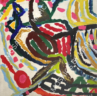
Open offices, creative studios, meeting rooms. These spaces benefit from work that's more energetically active: stronger color relationships, more dynamic compositions, greater visual complexity. Abstract paintings with visible gesture and expressive mark-making tend to work well here because they mirror the kind of thinking the space is designed to encourage.
Quick Reference: Abstract Art for Different Office Environments
Office Type | What to Look For in the Painting | Scale | Palette Direction |
Private / solo focus | Resolved composition, slow visual movement, emotional calm | Medium to large (1 key piece) | Muted earth tones, warm neutrals, soft blues |
Home office | Personal resonance, texture, something you genuinely want to look at | Flexible to wall size | Any direction that feels right for the room |
Client-facing room | Confidence, specificity, professional weight, visible quality | Large format, single statement | Neutral base with one strong hue or depth |
Creative / collaborative | Energy, visible gesture, dynamic color relationships | Large or mural-scale | Richer, higher contrast, expressive palettes |
Executive / professional | Sophistication, deliberate restraint, high surface quality | Large, singular | Deep tones, warm neutrals, minimal palette |
Conference room | Visually interesting without dominating; supports conversation | Medium to large | Neutral with warmth; nothing too activating |
Scale: The Variable Most People Get Wrong
Office art almost universally goes too small. The reasons are understandable: smaller pieces feel like a lower-stakes commitment, they're easier to move, and they seem less likely to make a statement you'll regret. The result is usually a 16-by-20 print floating on an eight-foot wall, looking like it arrived by accident.
Large artwork for office walls isn't a luxury consideration. It's a functional one. An undersized piece in a professional space reads as tentative. It suggests either that the choice was made without conviction or that the space wasn't thought through. Neither impression serves you in a professional context.
The working rule: the primary artwork in any given office wall should cover at least 60 percent of the wall's width. For a wall that's ten feet wide, that means a piece that's at minimum six feet across. For a standard eight-to-nine-foot commercial office wall, most single pieces should be 48 inches wide or larger to read with appropriate authority. If budget or logistics make that difficult, a diptych or triptych format can achieve the same visual weight across a larger footprint.
Wall Width | Recommended Minimum Art Width | Format Options | Notes |
6 to 8 feet | 40 to 54 inches | Single piece or diptych | Most standard private offices |
8 to 10 feet | 54 to 72 inches | Single piece, diptych, or triptych | Conference rooms, larger offices |
10 to 14 feet | 72 to 100+ inches | Large single piece or multi-panel | Executive suites, reception areas |
14+ feet | Full-wall or near full-wall | Commission or large-format original | Lobbies, large conference spaces |
Best for | Single strong statement | Deliberate multi-panel | Depends on budget and architecture |
Color in Office Environments: What Works and Why
Color in abstract office wall art operates differently than color in residential spaces. The considerations are partly psychological (what does sustained exposure to this palette feel like?), partly interpersonal (what does this communicate to people who see it?), and partly practical (what does this do to the room's lighting and proportions?).
Palettes That Work Across Most Professional Contexts
Warm neutrals with depth tend to be the most consistently effective palette for professional office artwork. Ochres, warm grays, charcoals, muted golds, and deep creams read as sophisticated and intentional without demanding a specific emotional response from the viewer. They also tend to perform well under the range of lighting conditions found in commercial spaces, from fluorescent overhead lighting to warmer task lighting.
Deep, single-accent palettes are also strong: a piece built predominantly around a rich blue, a deep forest green, or a warm terracotta with neutral grounds can anchor a professional space without overwhelming it. The key is that one strong color direction with supporting neutrals tends to read as deliberate in a way that many-colored compositions don't always achieve.
What to Reconsider in Professional Settings
Very bright, highly saturated palettes can introduce a level of visual energy that works against focused work and can feel slightly informal in client-facing spaces. This isn't a rule. There are contexts where that energy is exactly right. But it's worth being honest about whether you're choosing a vivid piece because it suits the room or because it's visually exciting in the moment of purchase.
All-neutral, very low-contrast work runs the opposite risk: disappearing into the wall and contributing nothing to the space. The best abstract artwork for offices has enough contrast and color interest to register visually without demanding sustained attention. Finding that middle register, engaged but not activating, is the real challenge and reward of choosing well.
Original Paintings vs. Prints in Professional Office Settings
This question matters more in a professional office than almost anywhere else, and the reason is perception. Clients, colleagues, and visitors to your office are reading the space for signals about who you are and how you operate. An original painting, even a modest-scale one, sends a different signal than a print.
The difference isn't primarily about money. It's about intentionality. An original abstract painting in a professional office communicates that someone made a specific, considered choice, not a category purchase. It suggests an investment in the space and, by extension, in the work that happens there. Visitors rarely consciously articulate this, but they register it.
From a practical standpoint, originals also hold up better to sustained attention. Modern office artwork prints can fade, especially near windows. They can look increasingly mass-produced with familiarity. An original with real surface texture and the physical evidence of being made holds its interest over time in a way that reproductions typically don't.
Metal prints occupy a genuinely useful middle position for professional offices. The aluminum substrate produces luminosity and depth that standard canvas prints don't have, and they're durable in high-traffic commercial environments. For offices with contemporary or industrial design aesthetics, a high-quality metal print of a strong abstract work can perform nearly as well as an original from across the room.
Format | Professional Signal | Durability | Best Office Context | Price Range |
Original painting | Highest — specific, deliberate, singular | Excellent with care | Executive offices, client-facing rooms | $500 to $10,000+ |
Metal print | Strong — contemporary, polished finish | Very high (commercial-grade) | Modern offices, high-traffic spaces | $150 to $900 |
High-quality canvas print | Moderate — depends on quality and presentation | Good | Home offices, lower-traffic spaces | $60 to $500 |
Standard print (framed) | Lower in professional contexts | Variable | Secondary walls, shared areas | $30 to $300 |
Original Abstract Paintings for Office Spaces: What We Make at Mosaics by Marc
We make original abstract paintings, full stop. No reproductions, no editions, no licensed prints. Every piece Marc Miller creates exists once and goes to one place.
Marc's background is worth understanding in the context of office art specifically. More than 35 years in commercial real estate in New York means he has spent a career thinking about how built environments function, how space communicates, and what it takes to get the relationship between a room and the people in it right. The work isn't made in a vacuum. It comes from someone who understands professional spaces from the inside.
The collection spans scales appropriate for both private offices and larger professional environments. Pieces range from intimate works suited to a home office or secondary wall to large-format originals designed to command a primary office wall with the kind of authority that only an original carries. We also offer metal prints of select works for offices where durability and a contemporary finish are priorities.
If you're working through a decision about abstract office wall art and want an honest conversation about what might work for your specific space, reach out at mosaicsbymarc.com/contact. The collection is available at mosaicsbymarc.com/wall-art. We're happy to look at photos and give a direct read on what would and wouldn't work.


Frequently Asked Questions
Q: What abstract art is best for an office?
Abstract art for an office works best when it has visual resolution, meaning the composition feels settled and the eye can rest in the piece rather than being pushed around by it. Warm neutral palettes, deep single-accent color relationships, and pieces with genuine surface quality tend to perform well across sustained daily exposure. The most important variable is often the scale: office artwork almost always benefits from going larger rather than smaller.
Q: Does art in the office actually improve productivity?
Research suggests yes, meaningfully so. Studies in environmental psychology have consistently found that enriched work environments with artwork produce higher self-reported productivity and wellbeing than stripped-back spaces. The effect appears to come from the way art provides soft fascination, a form of low-demand visual engagement that allows mental recovery during work without requiring sustained attention.
Q: What size abstract art should I get for an office wall?
Aim for a piece that covers at least 60 percent of the wall's width. For a standard 8-foot office wall, that means a minimum of 48 to 54 inches wide. Larger is almost always better in professional environments. If a single piece at that scale isn't feasible, a diptych or triptych arrangement can achieve the same visual weight across a larger footprint.
Q: What colors work best for abstract art in a professional office?
Warm neutrals with depth (ochres, muted golds, warm grays, deep creams) tend to be the most consistently effective across different lighting conditions and professional contexts. Deep single-accent palettes (a rich blue, a warm terracotta, a forest green with neutral grounds) also work well. Highly saturated, high-contrast work can be effective in creative or collaborative spaces but tends to be more demanding for focused solo work environments.
Q: Is an original painting worth it for a home office?
If you spend significant time working in that space, yes. An original abstract painting holds its visual interest better than a print over long-term daily exposure, and the physical texture of an original responds to light in ways that reproductions can't replicate. For a home office used consistently, the difference between a quality original and a print becomes apparent within the first year.
Q: What makes abstract art look professional in an office?
Specificity and scale are the two factors that most consistently distinguish professional-looking abstract office wall art from generic decoration. A piece that feels like it was chosen for a reason, that has a visual coherence and point of view, reads differently than one that was selected to fill a wall. Scale also matters enormously: undersized artwork in a professional space reads as tentative regardless of the work's quality.
Q: How is abstract wall art for a home office different from a professional office?
A home office allows more personal expression and emotional specificity in art choices because the primary audience is you. A professional office requires the work to function for you while also reading as deliberate and considered to clients and colleagues. The best abstract art for a professional office tends to be more compositionally resolved and palette-restrained than what might feel right in a personal space, though the line isn't absolute.
Q: Can abstract art be calming in an office?
Absolutely, and for many work environments that's exactly what you want. Abstract paintings with slow compositional movement, harmonious color relationships, and a quality of resolution tend to have a genuinely settling effect in spaces used for focused work. The research on art and workplace wellbeing consistently points to this quality. The key is avoiding work that's energetically activating in a space where the goal is sustained calm concentration.
Q: Where should I hang abstract art in an office?
The primary piece should typically hang on the wall most visible from the primary work position, so it can provide ambient visual engagement without requiring you to turn around. In client-facing offices, the wall facing the visitor seating is the highest-impact placement. Center height of 57 to 60 inches from the floor is the standard hanging point for most professional environments.
Q: What is the difference between abstract office wall art and general office wall decor?
Abstract office wall art refers specifically to original paintings or quality reproductions of abstract work, typically canvas or print-based. Office wall decor is a broader category that includes decals, signs, shelving arrangements, and other wall-mounted elements. For professional environments where you want to signal taste and intentionality, original abstract artwork or high-quality prints tend to perform significantly better than decor-category items.
Final Thoughts
The office you work in every day deserves more thought than most people give it. Not because aesthetics are more important than the work that happens there, but because they're not separate from it. The visual environment you inhabit shapes your focus, your mood, and the impression you make on everyone who enters that space. Abstract art, chosen well, is one of the most effective tools available for getting that environment right.
The decision comes down to a few things: choosing for long-term livability rather than first impression, getting the scale honest (almost always larger than your instinct), finding work that has enough visual quality and specificity to reward sustained exposure, and being clear about what the room is asking for before you decide what to put in it.
If you're working through this decision and want a second opinion on what might work for your specific space, feel free to drop a question in the comments or reach out directly. The right piece is out there. It's worth taking the time to find it.
Pricing estimates referenced in this article reflect general market ranges as of June 2026 and will vary by artist, format, size, and supplier. Always confirm current pricing directly with the seller before making a purchase decision.


Comments